July 8, 2020Comments are off for this post.

Magda Archer

A great artist and illustrator from London.

London artist and illustrator Magda Archer creates cool kitsch art characters sharing bad words.

Archer's retro artwork is completely has a surreal kitsch sensibility. Magda grew up in a minimalist, modern house with designer parents who enjoyed quiet spaces. Perhaps rebelling because of her parents' harsh taste, Magda embarked on an artistic career filled with color, embellishment, and visual humor. Her first degree was in Graphic Design at the Chelsea School of Art.

Recently she collaborated with Marc Jacobs and I managed to get one of the bags in this collection (the orange one) 🙂 … happiness.

I share some of the things about her work that I like, and enjoy!

Magda Archer. Yoenpaperland.

Collaboration with Marc Jacobs.

Magda Archer x The Men's Intarsia Sweater Marc Jacobs in 2020 ...
Magda Archer x Marc Jacobs Collection Lookbook | HYPEBAE
MARC JACOBS x MAGDA ARCHER by Michael Kusumadjaja (Hypebeast)

July 8, 2020Comments are off for this post.

Brooke Didonato

Cool surreal photographs mixing textures and pastel colors.

An Ohio-born photographer who mixes everyday scenes with the most surreal perspectives like no one else.

An art direction in a color palette and very careful settings + generally characters with their hidden faces present us with these great photographic stories to tell. The narrative simplicity that he uses in his photographs is his main attraction.

DiDonato studied journalism and became a photojournalist. He says in his biography that realizing that it was not really what he liked, he decided to dedicate himself to photographic art.

Its characters are located mostly in everyday environments, although we also see them among the flora or other spaces where they can hide parts of their bodies such as water or asphalt. The idea is that the viewer always has a story free to interpretation (which I love).

Instagram: https://www.instagram.com/brookedidonato/

Web Page:http://www.brookedidonato.com/

Brook Didonato. Yoenpaperland
Brooke Didonato. Yoenpaperland.
Brook Didonato. Yoenpaperland

May 2, 2020Comments are off for this post.

Mary Ellen Mark

Photo Journalism far from Mainstream society.

Mary Ellen Mark fue una fotógrafa estadounidense conocida por su fotoperiodismo, fotografía documental, retratos y fotografía publicitaria.

Descubrí su trabajo en internet al encontrar una foto de dos niñas en una piscina, una de ellas fumando y con un traje de baño idéntico al que alguna vez tuve a los 7 años.

Mary murió en 2015 pero sin duda me encantaría presenciar alguna exposición de su trabajo.

Acá comparto algunas de sus geniales fotografías:

MARY ELLEN MARK. ADIÓS A LA FOTOGRAFA HUMANISTA
Jeanette and Chastity Sandy, Mary Ellen Mark | Mia
JODIE FOSTER | PHOTOGRAPHY MARY ELLEN MARK | HARPER'S BAZAAR ...

March 22, 2020Comments are off for this post.

Happy Prints

Great and beautiful prints By Byron Eggenschwiler.☻

I recently saw the Netflix documentary "The Social Dilemma" and it would seem that this has nothing to do with my Byron Eggenschwiler post but it does.

Knowing from the documentary that all social networks make an algorithm based on the things you like and that from that they show you what you should consume because in part it makes me happy because thanks to this algorithm I have discovered as much music and cinema as cool artists like Byron.

Byron Eggenschwiler is an illustrator living in Canada.

His illustration style is amazing, cool, and with an air of darkness. I recently purchased 3 prints from his online store and he sent me 4 great postcards with the prints.

I am infinitely grateful to the algorithm of Google, Facebook, Instagram, and Pinterest for helping me to know the work of such great artists.

Enjoy their amazing work:

Byron Instagram: byronegg
Website: www.byronegg.com
Tumblr: byronegg.tumblr.com

The prints I bought:

I really like the feeling it gives me when I see your illustrations. They always make me smile.

Image of "Lovely Day"
Image of "Half Carrot by Morning"
Image of "Good Cake, Bad Cake"
Image of "The Crossing"

Some other illustrations from his website:

Personal — Byron Eggenschwiler
James Joyce's "The Dead"

Secret Tunnels
Doorway
‘Benediction’ by Kent Haruf
The Haunted School
Changing the Equation
aproblem.jpg
Finding The Right Structure For You

The House Is Haunted | Personal | Byron Eggenschwiler Illustration
Byron Eggenschwiler
Byron Eggenschwiler
Byron Eggenschwiler.
Hope and Skepticism | byronegg.com
/// haunted1big
Filling in the Gaps
—
A piece for Avenue Edmonton about how volunteers would rather donate in smaller chunks of time towards a larger cause and how to make that work for everyone. Thanks to AD Pete Nguyen!
The Night Beetles
Revenge!
Blocked
—
For a piece in Avenue magazine on the creator of LikeBlockr, an app that blocks you from viewing and giving likes on instagram. Big thanks again to AD Pete Nguyen!
Byron Eggenschwiler

February 14, 2020Comments are off for this post.

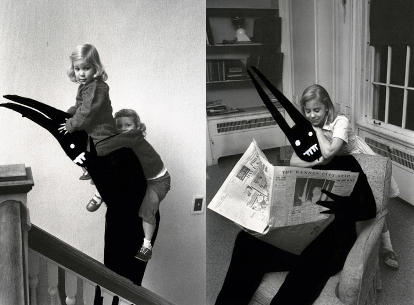
Horror Art by Aaron B. Heimlich.

Love is ... finding great things on the internet like this.

Horror Art by Aaron B. Heimlich.

Some time ago I came across the series of photomontages by Aaron B. Heimlich and I was fascinated by the simplicity of his art. About the artist's project: “Shedim is a Hebrew word to call a benevolent demon. They live with us and are always around us, the fact that we don't see them is because we have to open our eyes and our minds more. ” In the series, Heimlich reminds us that these demons are there and he does it using old photographs. This aims to demonstrate that the Shedim accompanies us in all kinds of everyday situations, whether in a graduation ceremony, nursery, hairdressing or even in our own home.

Enjoy! ☻

January 27, 2020Comments are off for this post.

BOTANICAL CHARTS

Modern Botanical charts. A small collection for decorating spaces in your home. ☻

December 9, 2019Comments are off for this post.

PANTONE RED


June 8, 2018No Comments

What graphic elements should we consider when developing an identity.

The word "Branding" is an anglicism used in the world of marketing to define the process of creating a brand. Beyond a simple logo, a Graphic Identity should help your business connect with your customers and convey an attractive and functional way of what you are trying to sell.

A well-executed graphic identity perfectly describes the idea and feeling behind a company, so it is very important to be clear about the concept that you want to transmit and from there, work with the elements that help you represent it correctly through visual identity.

These elements are:
1. Color
2. Composition (typography, graphics)
3. Aspect (formats, applications)

Composition

The concept behind a brand is the base structure from which we start sketching and designing. In the process that determines the identity, we must stop and ask ourselves: how does it make me feel? For example, if we had to create an identity for a health center, we could ask ourselves: does it give me peace of mind? Is the typography appropriate? In this particular case, choosing a typeface with rounded corners would be an excellent decision, since the typeface with straight cuts reflects tension.

Color

We must also ask ourselves if we are using the right colors since generally our mind and references learned during life push us to feel a certain way when observing the color and it is very important to know about psychology and color semiotics for a good integration when creating a creative concept.

Appearance

The use of the wonderful grid is a fundamental part of any identity. Symmetry is the way in which we establish a visual order, and this is reflected in the aesthetics of any graphic identity.

Every day, in every observation we exercise, we try to accommodate objects in an imaginary space in such a way that they cause stability. This way of mentally ordering things is a fundamental principle when creating an identity, regardless of whether or not you have a background in design. Observing the elements correctly arranged in a grid generates a sense of order and cleanliness. A saturated design without a grid creates a feeling of stress, and it is unpleasant to the eye.

A different perspective

It is interesting to observe the importance of a graphic identity applied in a different artistic discipline, such as the cinema.

Already being clear that identity gives value to your words, to your idea, and that in all the artistic fields the identity dictates the aesthetics; let's talk about how the filmmaker Stanley Kubrick applies a graphic identity for the promotion of his films by means of a poster. We can see in the posters of Stanley Kubrick films very well-chosen typography, colors, photography and graphic elements. This is clearly the case of someone who knows the importance of graphic composition in order to represent and sell an idea.

Alfred Hitchcock and Stanley Kubrick worked with graphic designer Saul Bass to create posters to promote their films. It is no coincidence that these great film directors knew the importance of the graphic image to better sell their projects.

Another filmmaker who uses this knowledge is Wes Anderson. In his film "Hotel Budapest", he worked with graphic designer Annie Atkins to build the identity of both the hotel and Mendel's store. All the important principles of a graphic identity are reflected in the film: logo, colors, typographies, printed graphics on business cards, letterheads, packaging, uniforms, passports and newspapers, and a lot of other items used in the film. By integrating everything, we see how the graphic identity helps the viewer feel at a certain time and place, as well as letting us understand more deeply the story and its characters.

The human being is visual by nature, create a graphic identity based on this principle will help your customers become more familiar with your brand and it will help you transmit emotions by which they can relate.

© 2023 Yoenpaperland

Behance           Instagram          LinkedIn          Pinterest           Vimeo

× Hi! ☻