The word "Branding" is an anglicism used in the world of marketing to define the process of creating a brand. Beyond a simple logo, a Graphic Identity should help your business connect with your customers and convey an attractive and functional way of what you are trying to sell.
A well-executed graphic identity perfectly describes the idea and feeling behind a company, so it is very important to be clear about the concept that you want to transmit and from there, work with the elements that help you represent it correctly through visual identity.
These elements are:
1. Color
2. Composition (typography, graphics)
3. Aspect (formats, applications)
Composition
The concept behind a brand is the base structure from which we start sketching and designing. In the process that determines the identity, we must stop and ask ourselves: how does it make me feel? For example, if we had to create an identity for a health center, we could ask ourselves: does it give me peace of mind? Is the typography appropriate? In this particular case, choosing a typeface with rounded corners would be an excellent decision, since the typeface with straight cuts reflects tension.
Color
We must also ask ourselves if we are using the right colors since generally our mind and references learned during life push us to feel a certain way when observing the color and it is very important to know about psychology and color semiotics for a good integration when creating a creative concept.
Appearance
The use of the wonderful grid is a fundamental part of any identity. Symmetry is the way in which we establish a visual order, and this is reflected in the aesthetics of any graphic identity.
Every day, in every observation we exercise, we try to accommodate objects in an imaginary space in such a way that they cause stability. This way of mentally ordering things is a fundamental principle when creating an identity, regardless of whether or not you have a background in design. Observing the elements correctly arranged in a grid generates a sense of order and cleanliness. A saturated design without a grid creates a feeling of stress, and it is unpleasant to the eye.
A different perspective
It is interesting to observe the importance of a graphic identity applied in a different artistic discipline, such as the cinema.
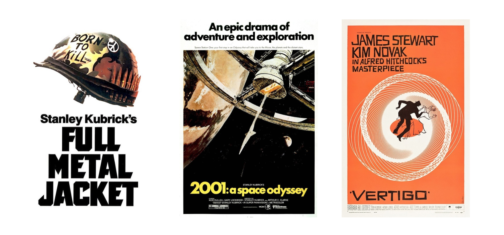
Already being clear that identity gives value to your words, to your idea, and that in all the artistic fields the identity dictates the aesthetics; let's talk about how the filmmaker Stanley Kubrick applies a graphic identity for the promotion of his films by means of a poster. We can see in the posters of Stanley Kubrick films very well-chosen typography, colors, photography and graphic elements. This is clearly the case of someone who knows the importance of graphic composition in order to represent and sell an idea.
Alfred Hitchcock and Stanley Kubrick worked with graphic designer Saul Bass to create posters to promote their films. It is no coincidence that these great film directors knew the importance of the graphic image to better sell their projects.

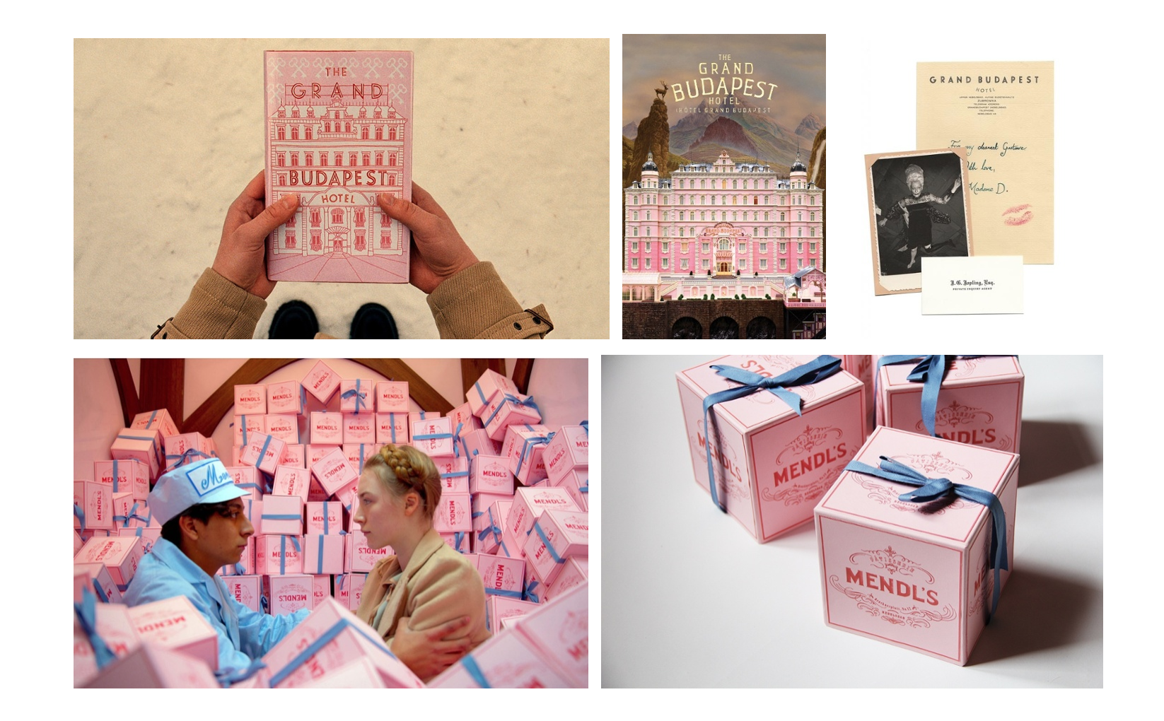
Another filmmaker who uses this knowledge is Wes Anderson. In his film "Hotel Budapest", he worked with graphic designer Annie Atkins to build the identity of both the hotel and Mendel's store. All the important principles of a graphic identity are reflected in the film: logo, colors, typographies, printed graphics on business cards, letterheads, packaging, uniforms, passports and newspapers, and a lot of other items used in the film. By integrating everything, we see how the graphic identity helps the viewer feel at a certain time and place, as well as letting us understand more deeply the story and its characters.
The human being is visual by nature, create a graphic identity based on this principle will help your customers become more familiar with your brand and it will help you transmit emotions by which they can relate.


No Comments.