PACKAGING DESIGN
Von Bee Super Foods.®
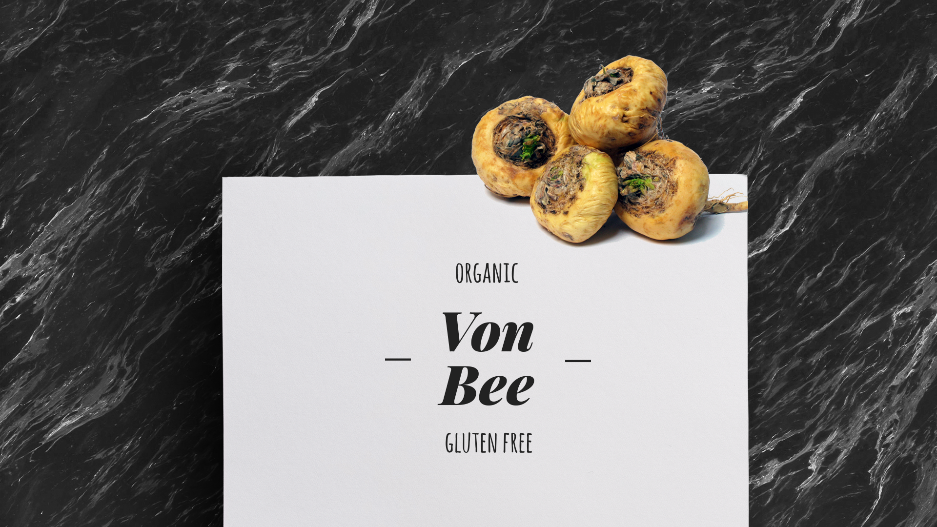
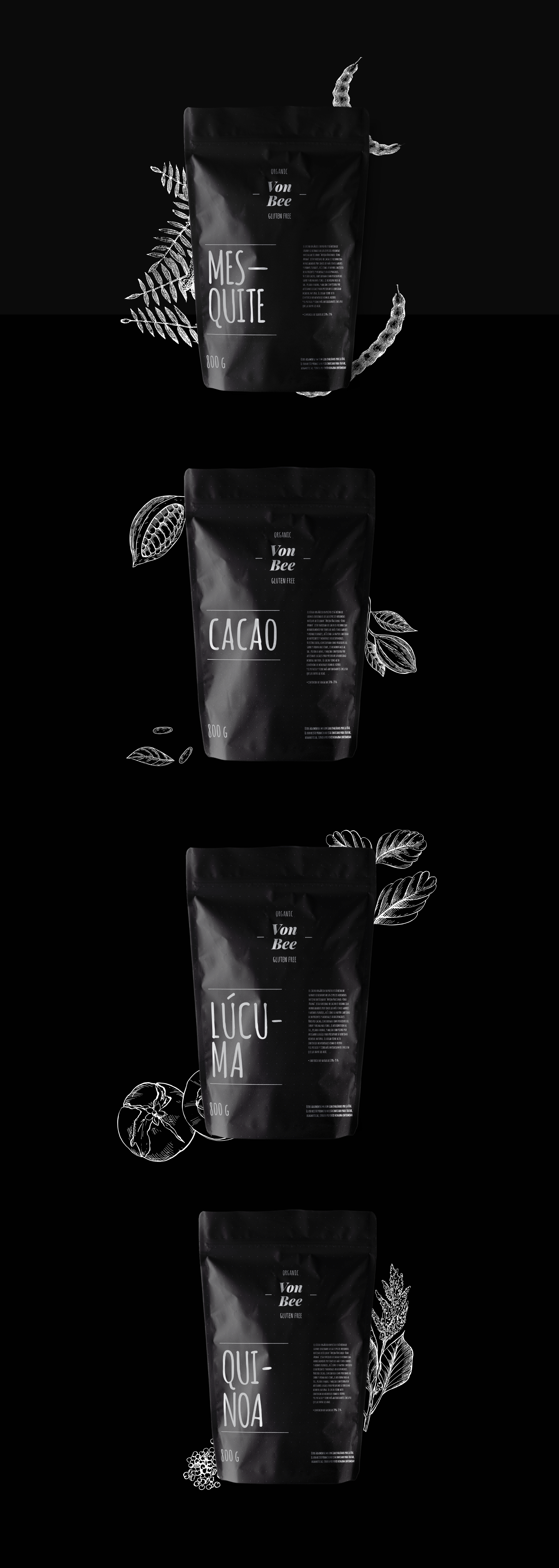
Von Bee is a brand of organic seeds and powders called "Super Foods" because of its properties. The main focus of this identity was to create a powerful and striking image that would impact the consumer from the packaging. The product stands out for the color palette we chose, since it is highly unusual to see the use of these colors in a similar product in the market. Organic fonts were used, referring to having been written by hand, so the typographic design is simple and it was created with the idea of being visible and easy to access when looking at a shelf in a supermarket.

