BRAND IDENTITY
Motto by Orange.®
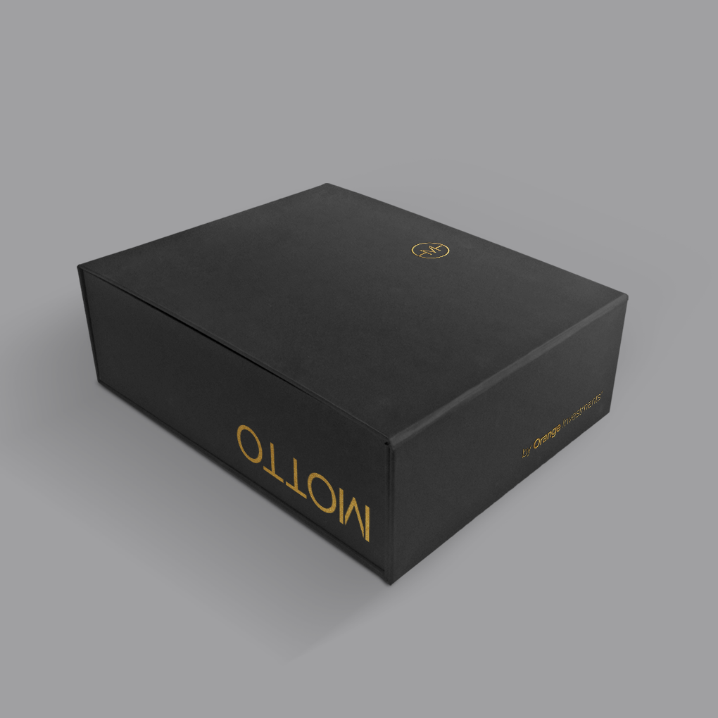
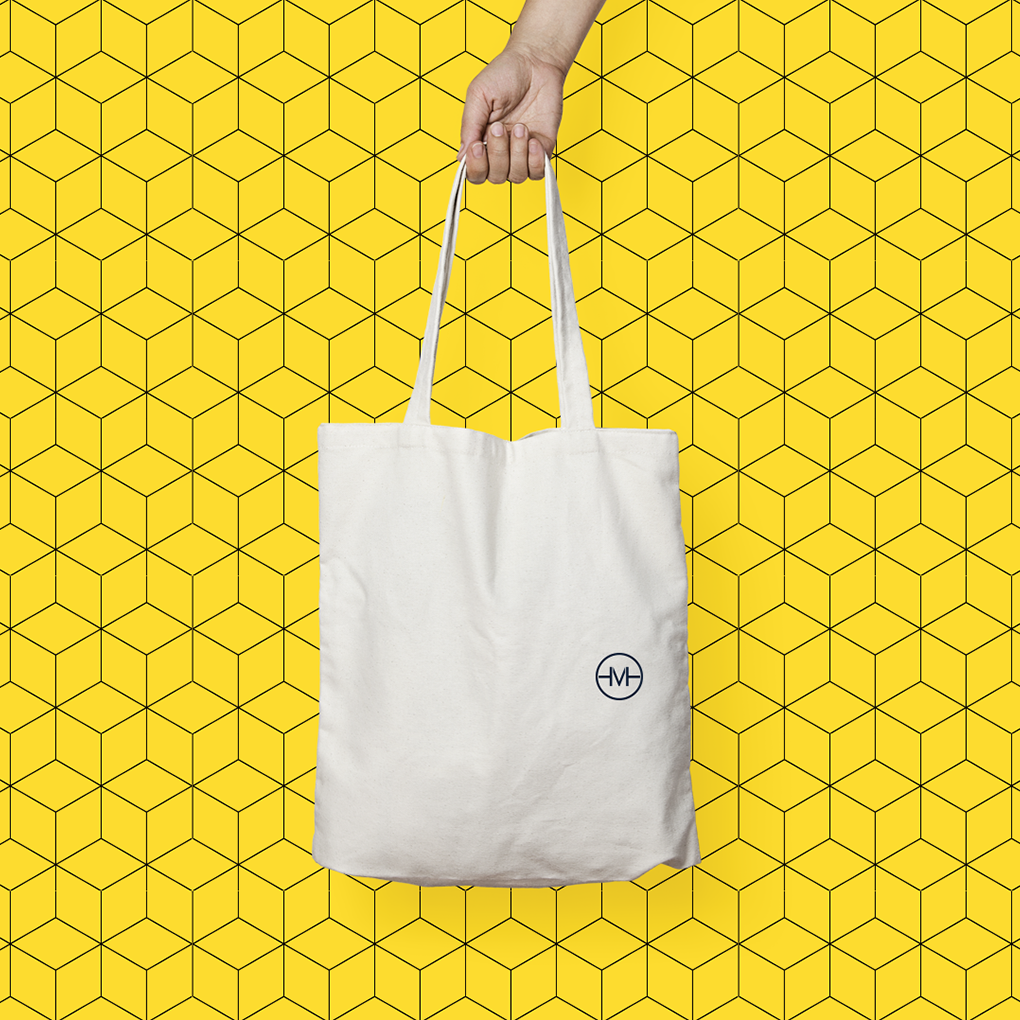
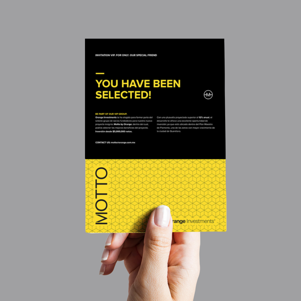
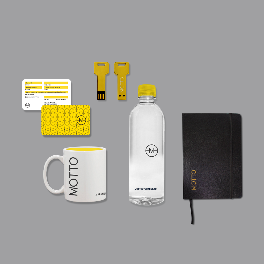
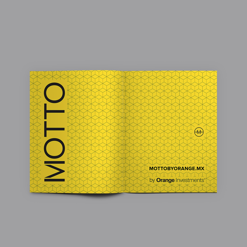
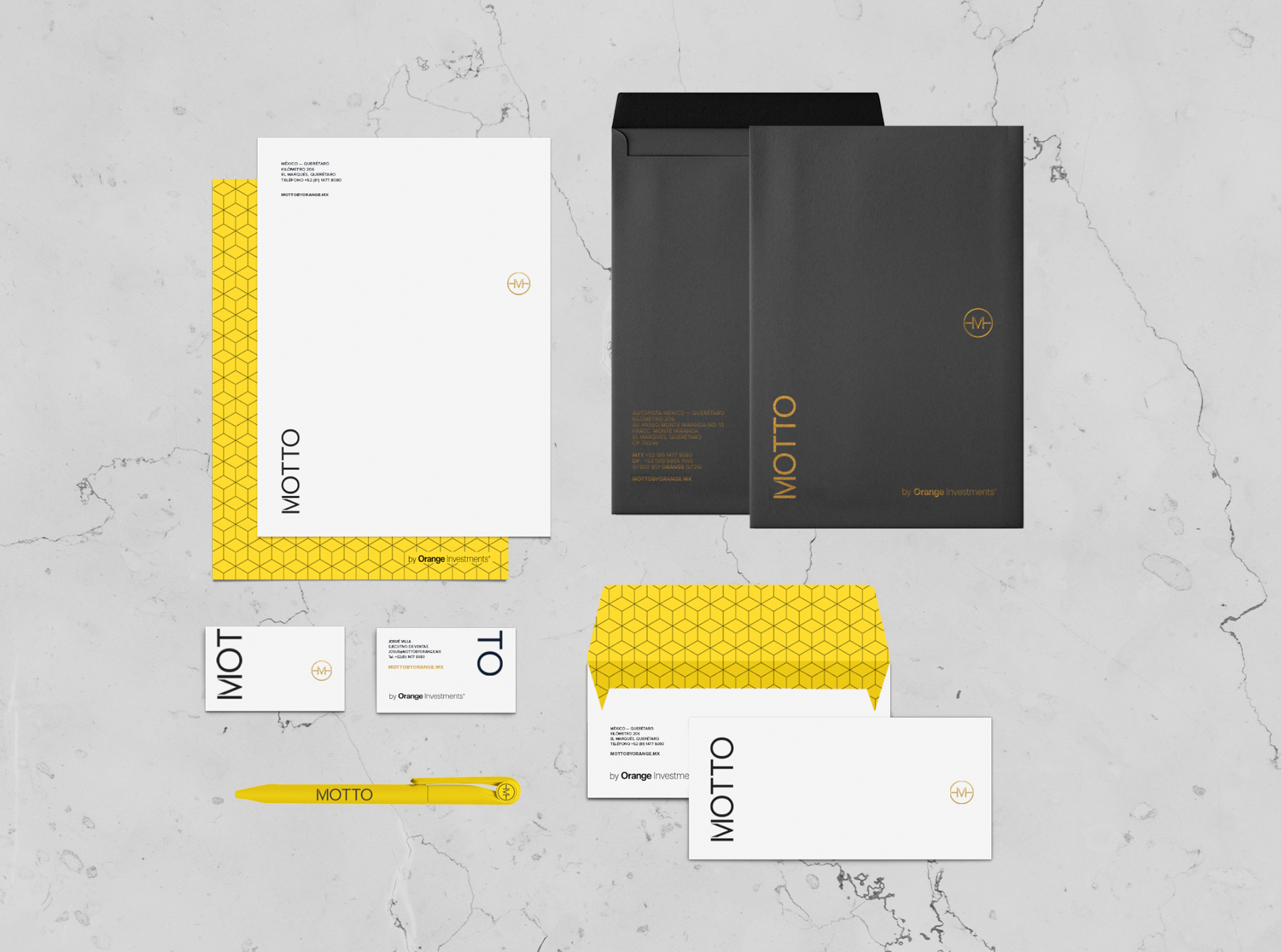
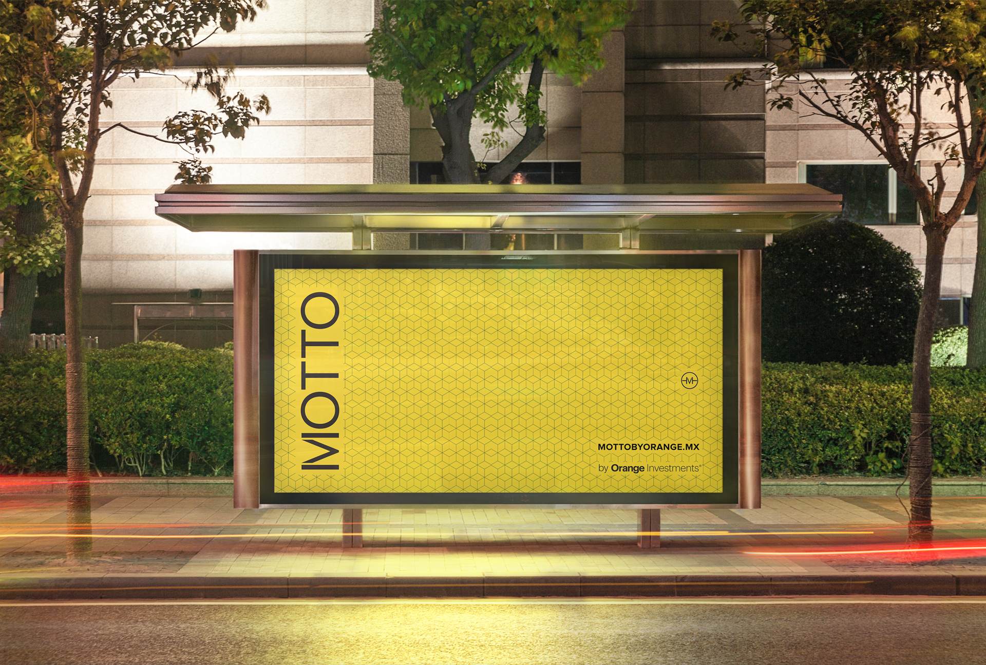
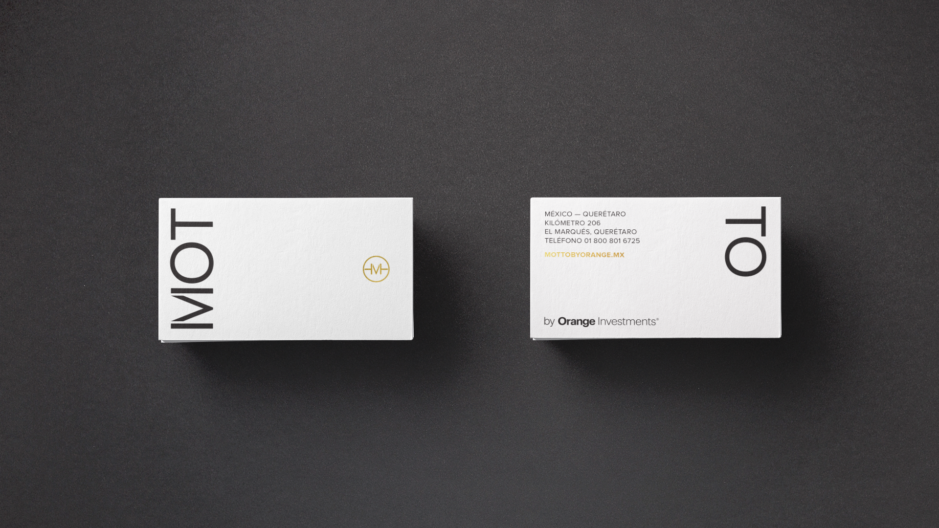
Identity and visual ecosystem for "MOTTO", a project developed by the firm Orange Investments.
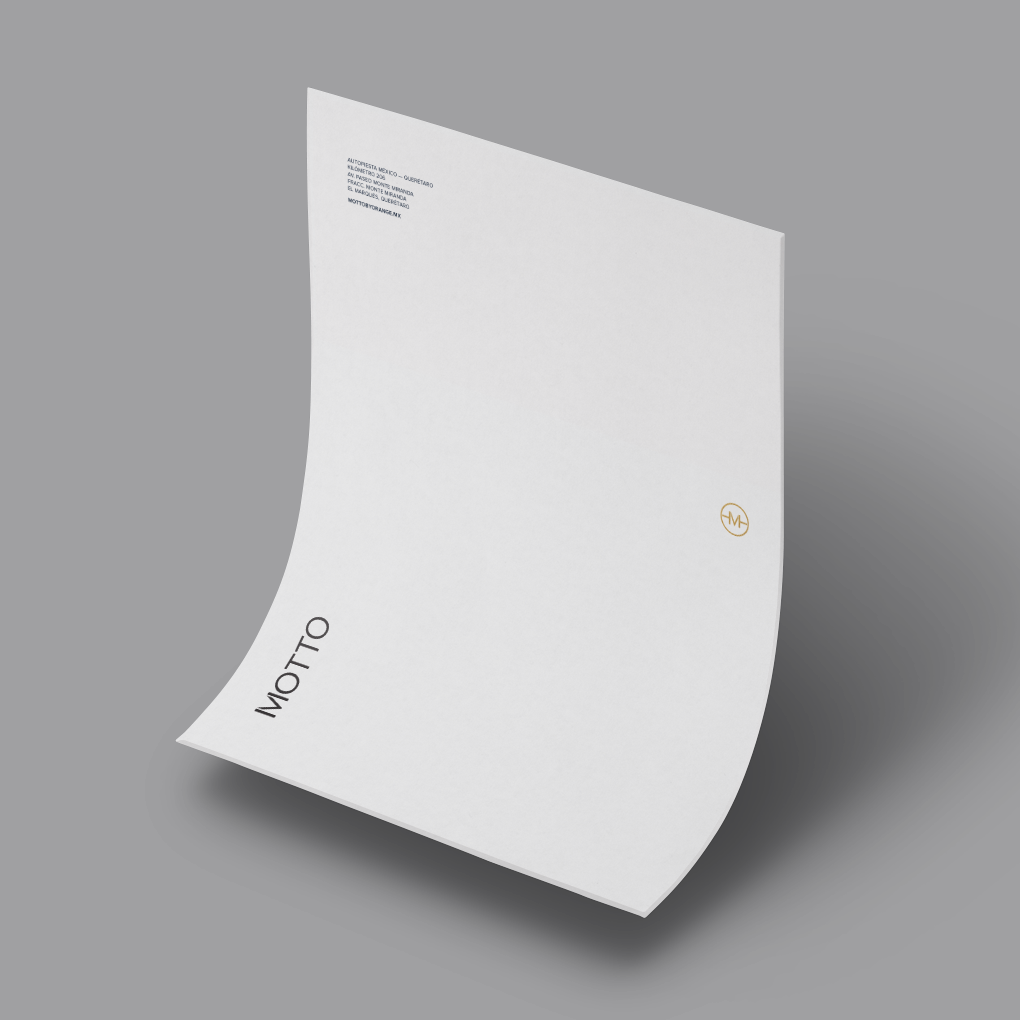
The identity reflects sobriety, style and minimalism, which are the main characteristics of this project development. For the integration and execution of all the materials, we created a pattern that represents the modern and symmetrical architecture of the project. The yellow color of the palette was chosen to appeal to risky investors who are always seeking to differentiate themselves from others. The color palette, patterns and the design itself was focused on attracting the attention of young investors.
—
Designed while I was Art Director at the agency Menosunocerouno.
Website: www.menosunocerouno.com