BRANDING
IVO Oftalmología.
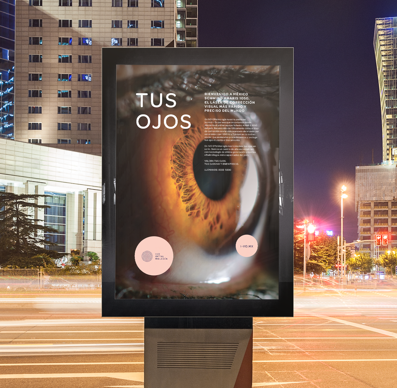
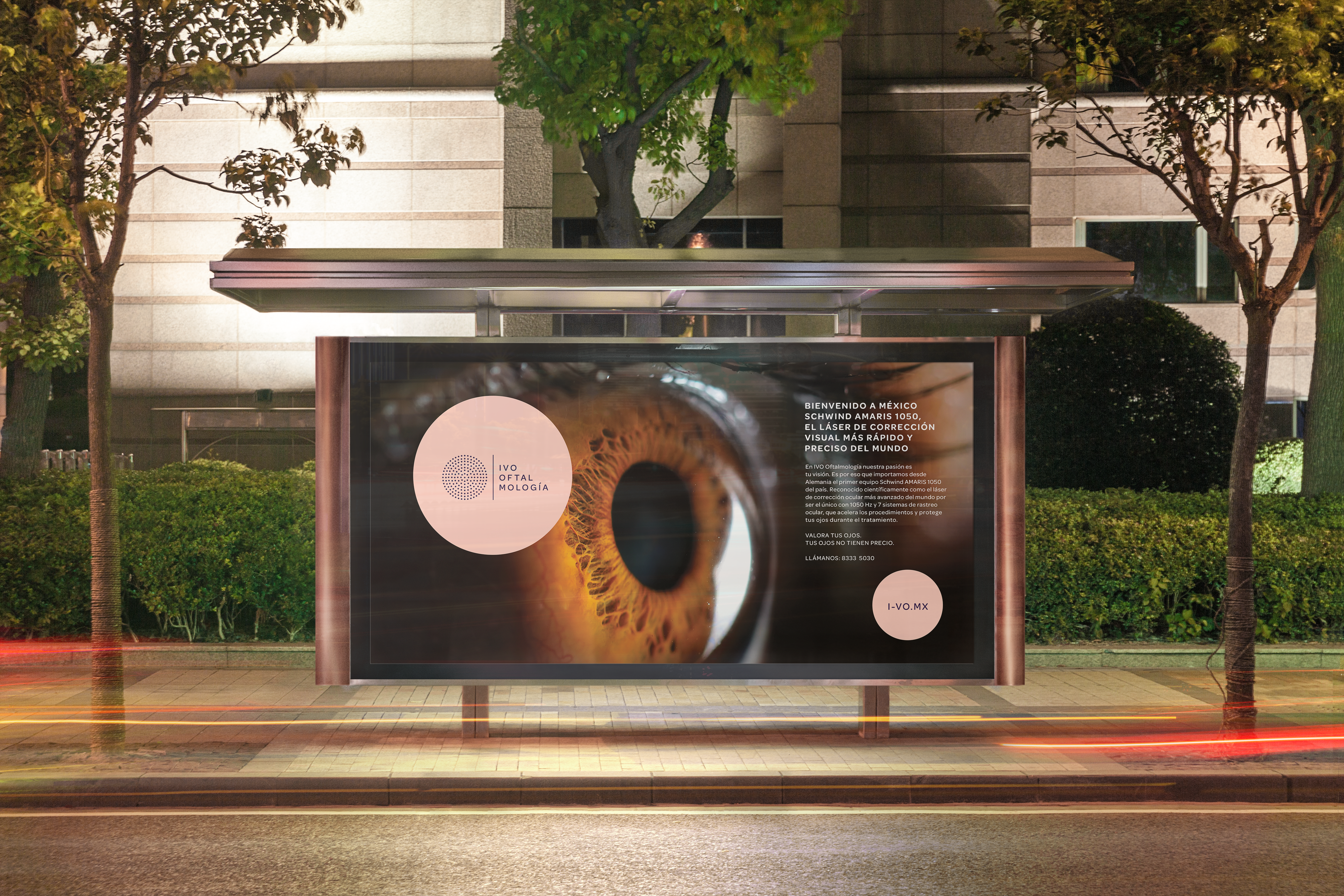
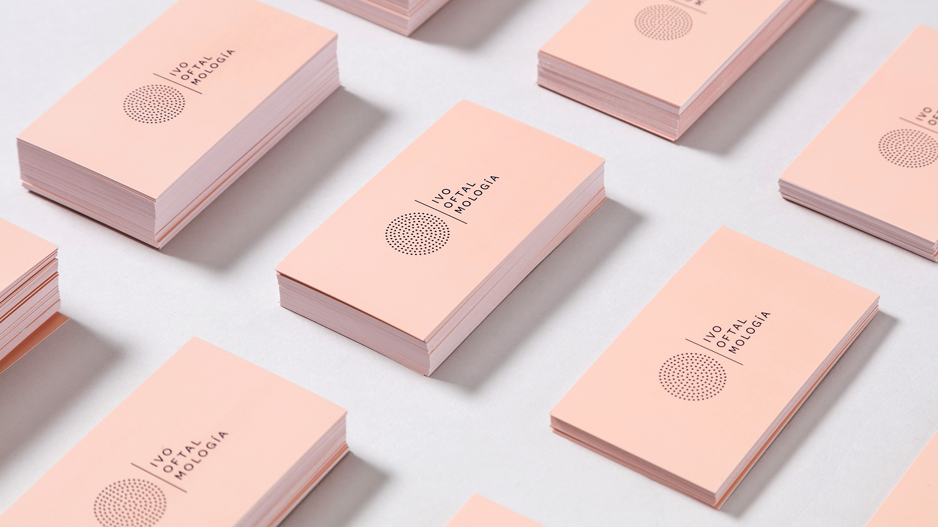
Graphic identity and advertising campaign for Ivo Ophthalmology ®
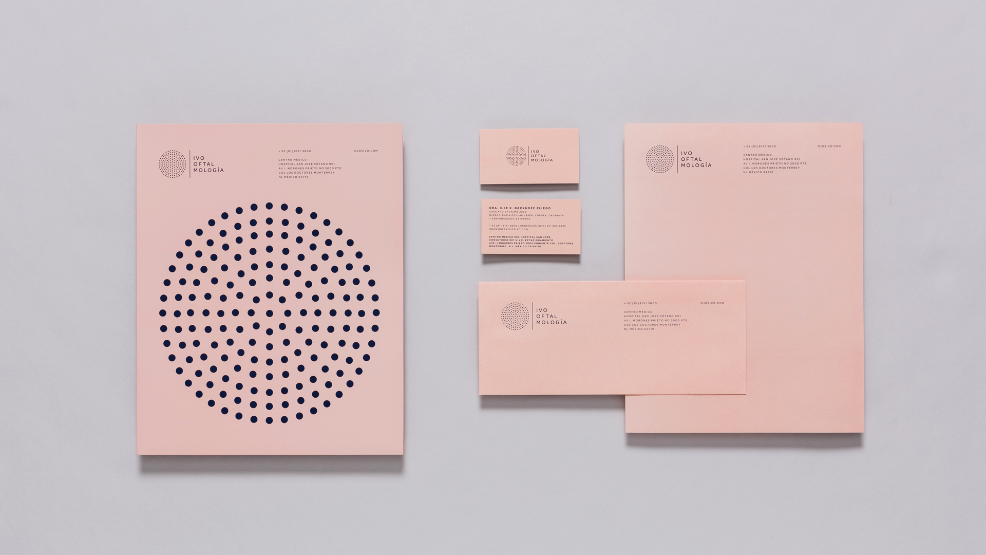
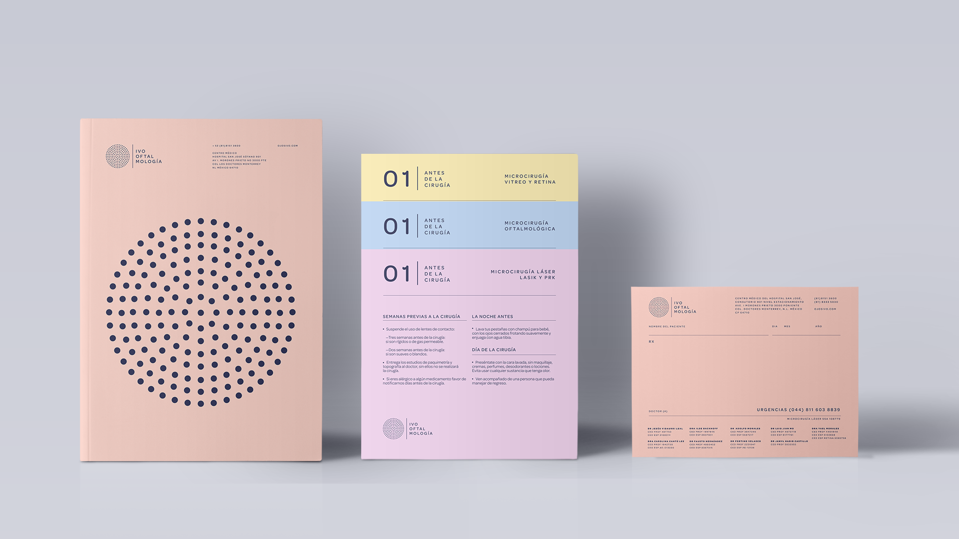
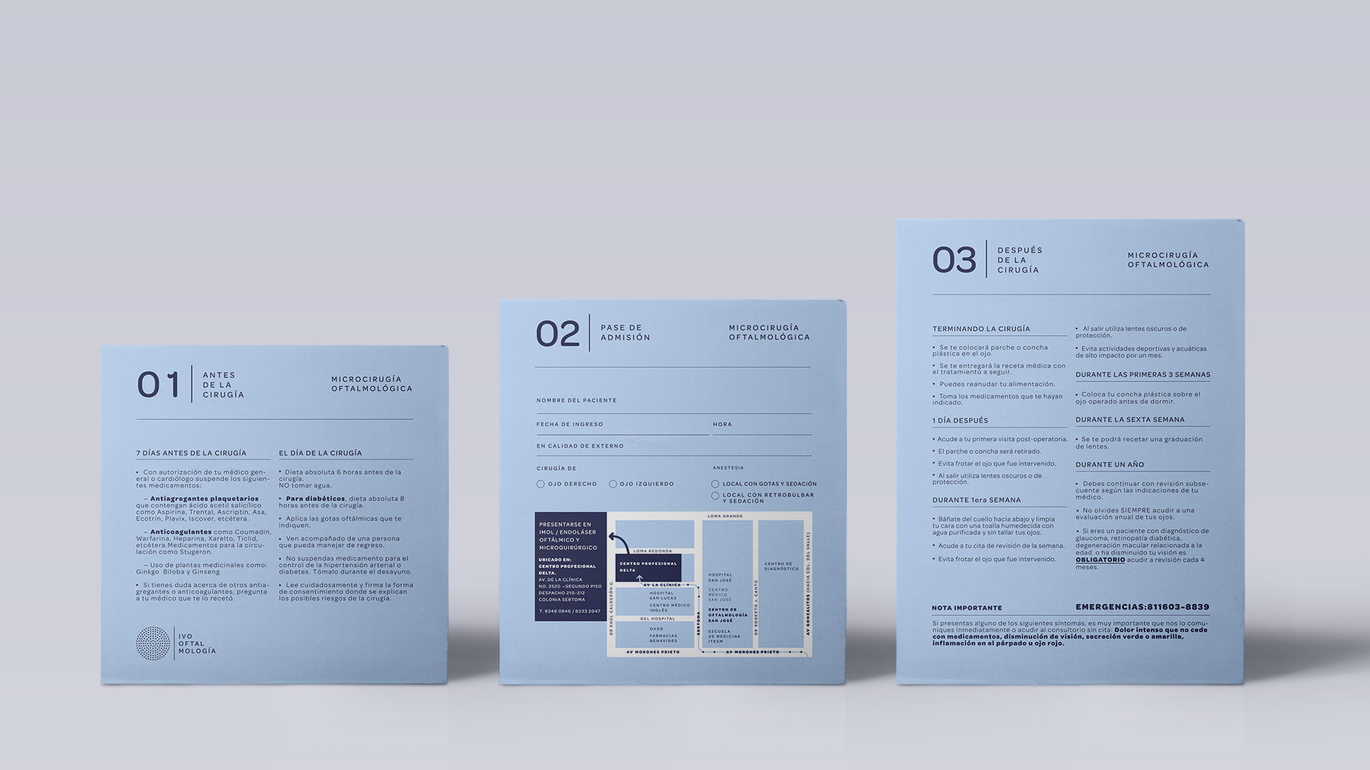
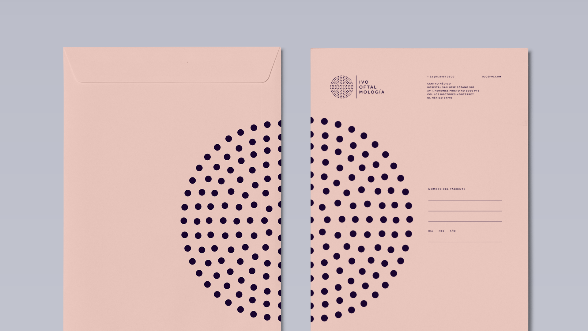
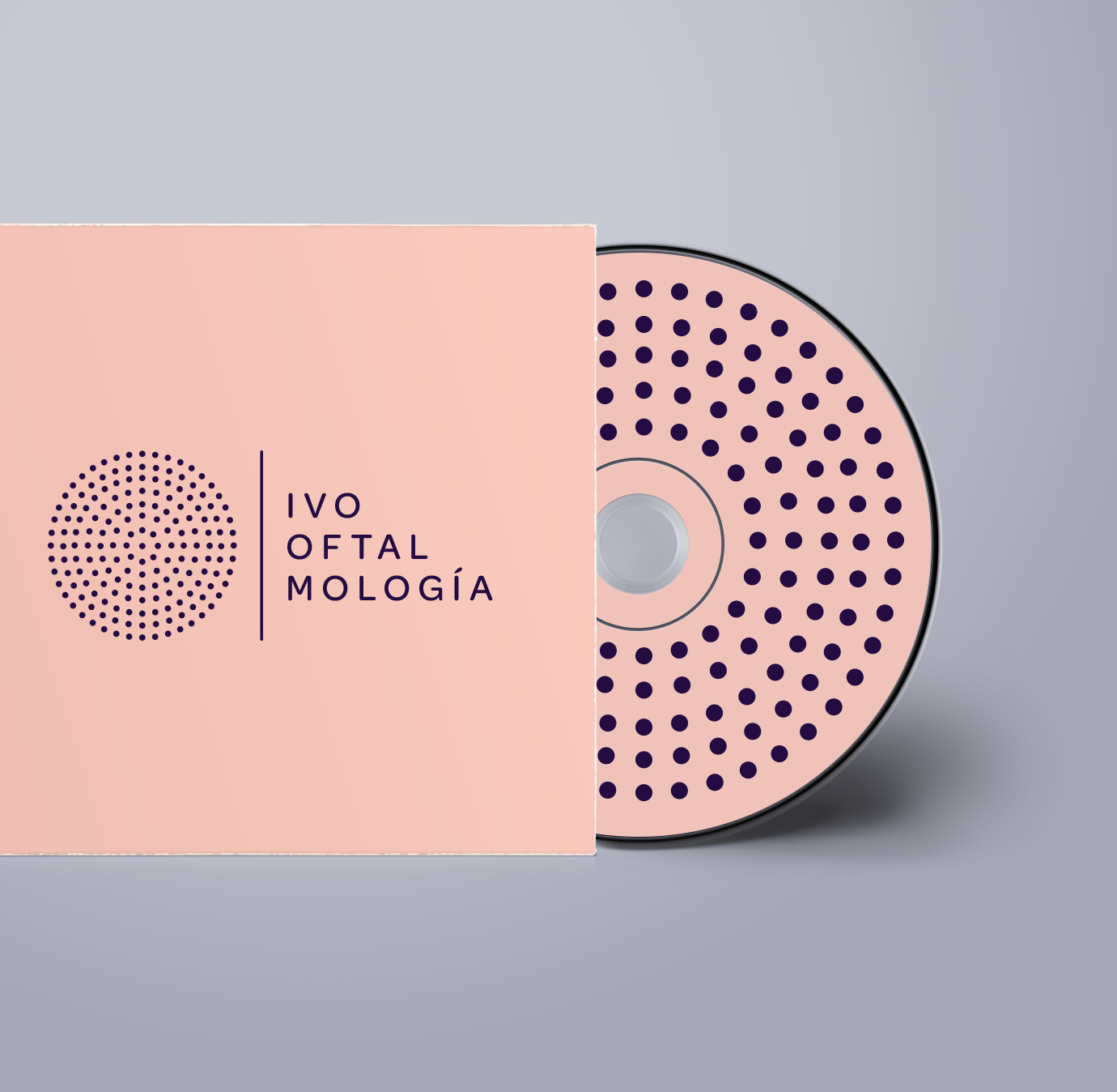
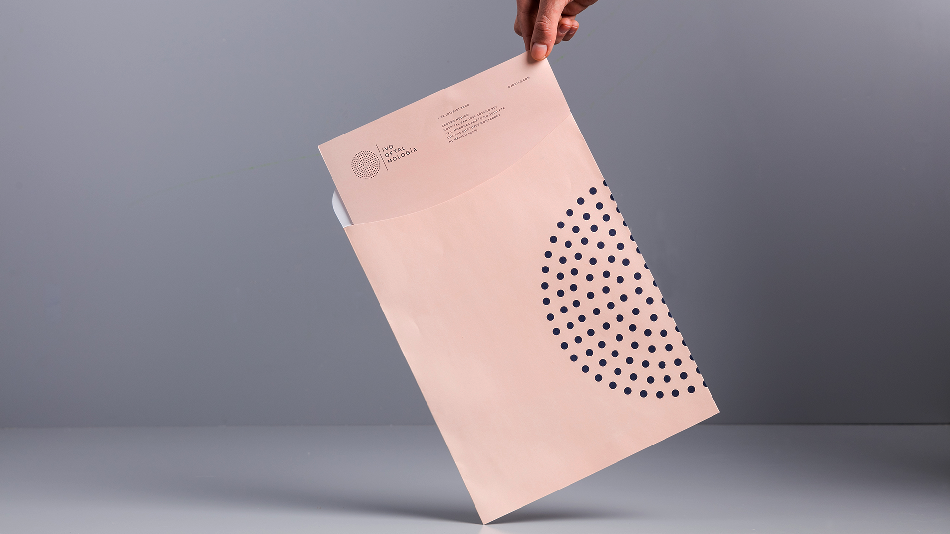
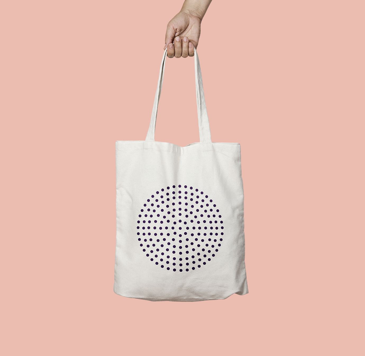
Less is more: Identity inspired by the Classic European Braun Radio. The perfection and symmetry of the circle utterly describe our eyesight, and by combining this element with the use of colors that represent warmth and tranquility, the art concept used in this project was brought to life. The idea behind this task was representing our sense of sight as something unique and perfect, as the symmetry of the circle composition.
http://www.ojosvidaurri.com/
—
Designed at the Menosunocerouno Agency as an Art Director.
Agency Website: www.menosunocerouno.com